Pepsi gets a new logo! A new design with more visual tension, adding a key image of “sugar-free” black
Since its launch in 1980, Pepsi has won a lot of supporters not only in European and American countries, but even in the world. The most significant influence can be seen from the indicators that the two giants, Pepsi and Coca-Cola, account for more than 70% of the US market. Or in daily life, when we want to drink Coke, we can hardly tell the answer outside of these two brands.
Although PepsiCo has gained a firm foothold in the global market, it still recently announced that the brand will be replaced with a new Logo, which is expected to be officially launched in August this year. This is also the refurbishment of the brand after 14 years since 2008. From the current logo of the brand, it can be seen that the lines are simple and slender, but the new logo to be replaced is different from the current version and has more visual tension. The bold font brings out strength and grace, and at the same time echoes the brand’s health policy: The formula of classic carbonated beverages has been changed to reduce its sugar content by 57%. In the future, the black color on the product packaging of “Pepsi without sugar” will be added to the LOGO design as one of the brand image colors in the future.
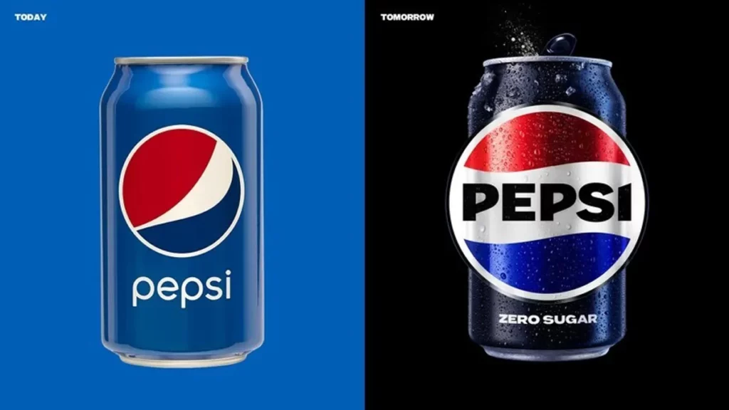
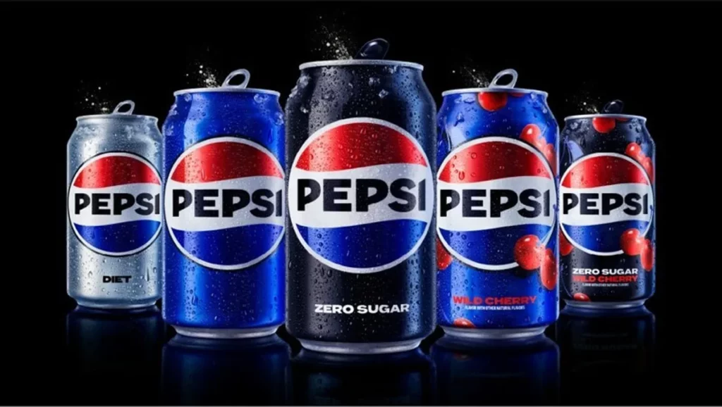
The re-evolution of brand vision is one of the best manifestations of trends. From the evolution of recognition vision, we can see the brand’s future ambitions and plans, just like human personality, which is constantly reshaping itself in the flow of time to find personality and positioning. This concept also responds to what PepsiCo Senior Vice President and Chief Design Officer said: “The new brand logo connects the futuristic with the brand’s tradition, while combining with modern elements to show our bold vision for the future. “
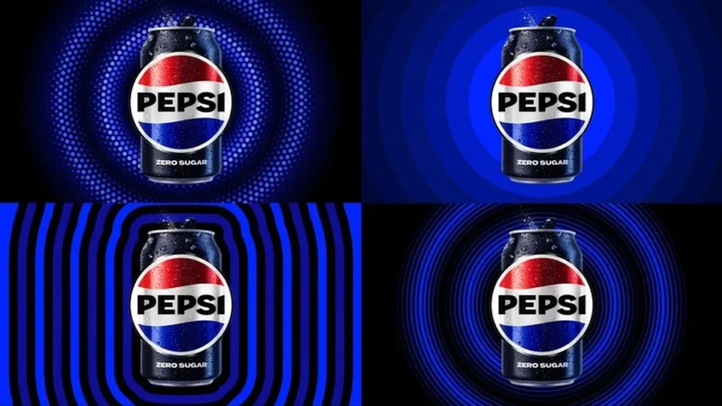
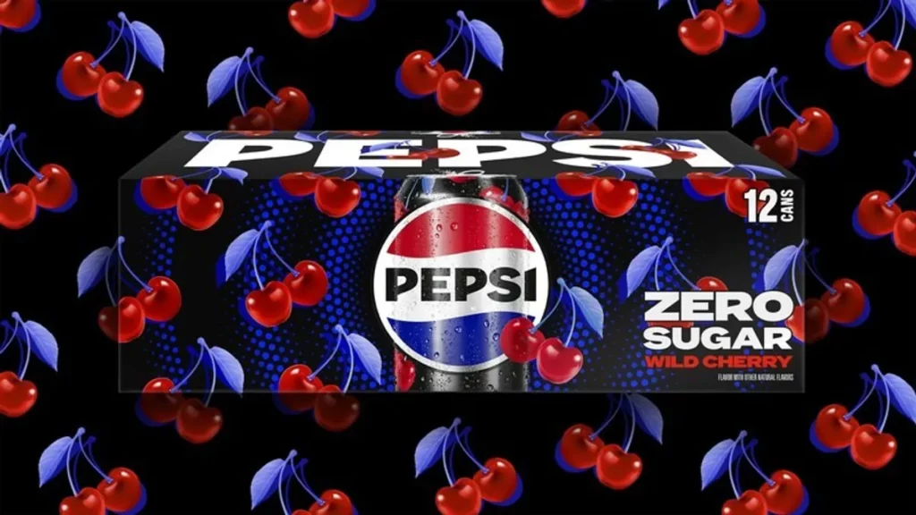
Pepsi’s new logo has a sense of nostalgia, returning to the classic version of the 1960s, combining Pepsi’s classic globe with “PEPSI”, recreating a bold, slanted stroke with fresh and dynamic fonts, and depicting it in black The purpose of the circular outline is to convey the flexibility of the brand to adapt to various complex environments, while emphasizing the unique branding of Pepsi.
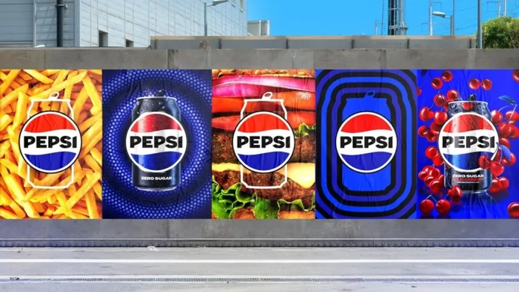
The new color scheme of the bottle body adds electric light blue (compared with the original blue tone of the brand, which is closer to purple) and black. The addition of black, as mentioned in the previous paragraph: Pepsi continues to pay attention to the adjustment of the sugar content of beverages, and uses black as the “sugar-free” version to distinguish it from the blue sugar-containing version, but both have a visually distinct bottle outline. The intention is to create a brand image that the general public can get close to. At the same time, in order to respond to today’s digitalization, a series of brand-new visuals applied to various carrier channels (such as car body, IG, clothing, advertising billboards, etc.) , conveying the infinite possibilities of the future.
PepsiCo’s new visual identity will debut in North America this fall, and will be officially launched globally in 2024. What kind of surprises will there be in the future, which will make people feel like opening a Coke can: the instant burst and hiss will make people excited, let us wait and see together.


